September 4, 2026
The SDMPBI suite grows to 11 Power BI visuals
September 2026 - Socio Data Management's family of Power BI visuals is growing.
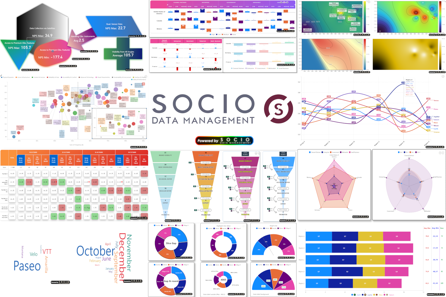
With five newcomers, the SDMPBI suite now counts 11 visuals, organised in three families: cross-tables, charts and metrics. They all share the same visual grammar and the same foundations: data-driven colours and logos, significance testing, 10 languages and Microsoft Fabric compatibility.
Tables: the cross-tab gets drawn
SDM Cross Table Charts takes the engine of our statistical cross-tab and replaces numeric cells with small charts drawn inside each cell:
- Data Bar: one diverging bar per cell, on a single table-wide axis so every bar stays comparable;
- Data Line: points connected into a trend, down rows or across columns, sparkline-style;
- Gap Mode: a column group collapsed into one to three gap columns - against the group average or two named competitors;
- Significance overlays: significant cells stand out with a colour, a gradient, a marker or an icon.
Think spreadsheet conditional-formatting bars, but hierarchical, statistically aware and fully stylable.

Charts: six visuals, two of them new
Alongside the Column Chart, Line Chart, Scatter Plot and Gradient Heatmap, two visuals complete the chart family.
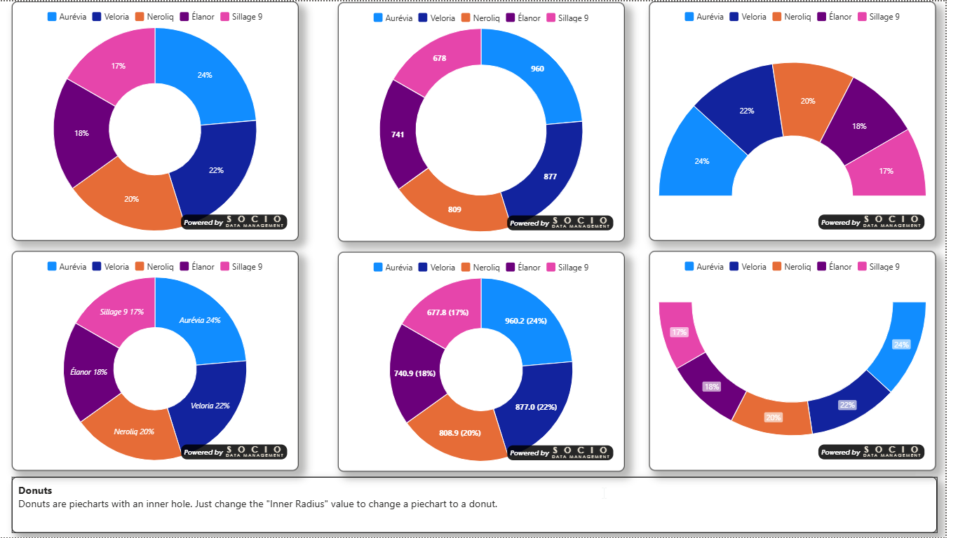
SDM Smart Pie Chart renders a composition as a pie, a donut or a half-circle gauge - a true half circle, where the whole series is laid out over 180°, not a cropped pie. Small multiples, concentric rings, regex-driven slice highlighting, target line and significance testing against a reference series.
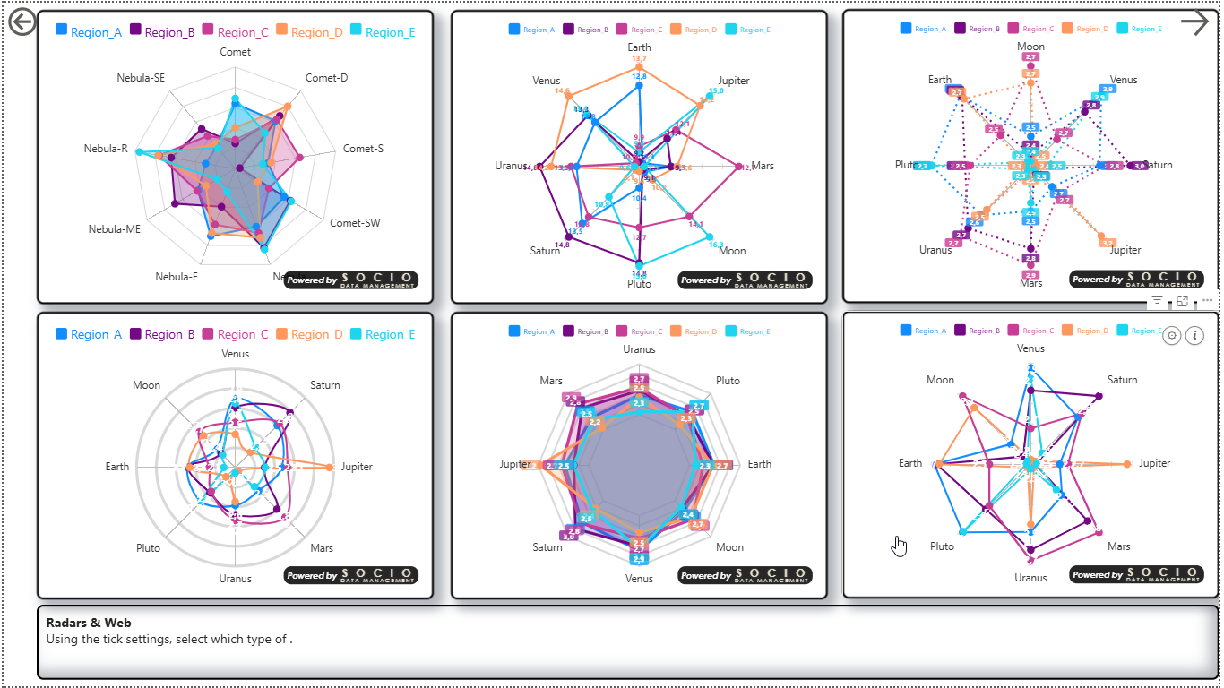
SDM Smart Radar draws a spider web where each axis carries its own scale: a score out of 50 and a score out of 10 sit side by side without one crushing the other. Manual per-axis bounds, small multiples with a reference ghost, up to three significance tests, background image and logos at the axis ends.
Metrics: the tile, the funnel and the word cloud
The metrics family now brings three visuals together.
- SDM Tile - the KPI tile in 17 shapes, which now also doubles as a two-position filter button driving the report page.
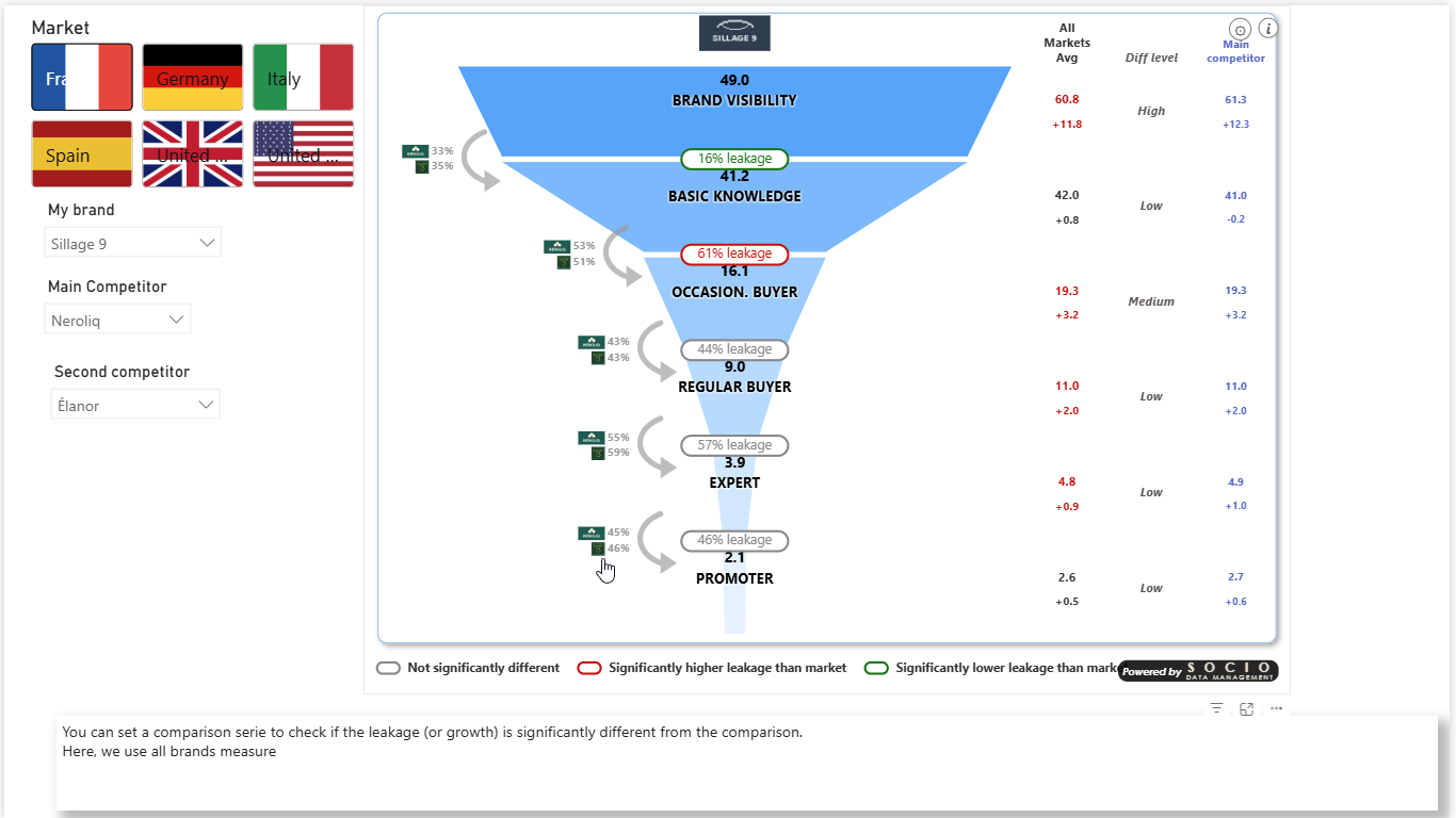
- SDM Funnel - a diagnostic conversion funnel: it computes the leakage between consecutive steps and tests whether each drop is statistically significant against a comparison group, with up to two competitors and eight extra columns.
- SDM WordCloud - an advanced word cloud with filtering, cross-filtering selection and highlighting of significant words against your numeric data.
Who is it for?
These visuals are built for survey research, brand tracking, executive dashboards and marketing analysis: wherever a figure has to be compared, tested and reported cleanly, without manual retouching afterwards.
Learn more
See the range on the SDMPBI Suite page, and the full documentation of each family:
- Tables: docs-table.socio-dm.com
- Charts: docs-graph.socio-dm.com
- Metrics: docs-metrics.socio-dm.com
Would you like a demo on your own data? Contact us.