
May 7, 2026
Three new Microsoft-certified Power BI visuals
May 2026 — The SDM Smart Graph Visuals suite joins the official Microsoft AppSource catalogue.
Three visuals developed by our teams have just been certified by Microsoft and are now available for direct installation from AppSource: Smart Column Chart, Smart Line Chart and Smart Scatter Plot. They complement our Smart Table visual, already available on AppSource (see the dedicated article).
Why these visuals?
Power BI ships with a rich native visual library, but its limits quickly show when it comes to producing professional market research deliverables: end-of-line labels, brand logos in legends, error bars, formats inherited from the semantic model, fine-grained handling of multiple series… as many everyday needs in our profession as there are shortcuts a standard visual cannot offer.
We built this suite precisely to fill that gap. Three visuals designed in the same visual grammar, sharing the same technical foundations, and engineered to produce charts as polished as those of traditional office documents — directly inside Power BI, with no manual touch-ups afterwards.
What Microsoft certification means
AppSource certification is more than a label. It involves a code review, security checks, and a guarantee for users that the visual does not leak any data to external systems. Concretely, this enables PDF and PowerPoint export of reports containing these visuals — a critical capability for our clients, and one that is impossible with a non-certified visual.
It is also a recognition of a level of rigour: in code quality, performance, and compliance with platform standards.
Three visuals, one shared foundation
The three visuals share a unified technical base: data-driven series colours, logos that can be displayed in legends, configurable labels, an Analytics pane with reference lines, error bars, customisable tooltips, and support for nine languages. All available in three editions (Free, Pro, Enterprise) to fit different needs and usage contexts.

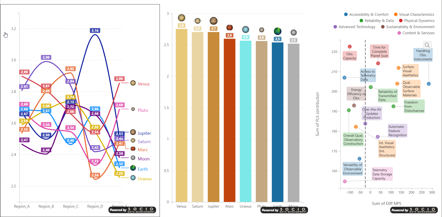
Smart Column Chart — Column and bar charts, grouped or stacked, with native handling of multiple series and per-series labels.
Smart Line Chart — Multi-series curves with end-of-line labels, ideal for time evolutions that can be read at a glance.

Smart Scatter Plot — XY scatter plots with size encoding and inset zoom, for positioning and correlation analyses.
What's next?
Two more visuals are being finalised and will join the suite in the coming months: a Gradient Heatmap and a Metric Tile. The objective remains the same: provide market research teams and data leaders with a coherent, elegant and certified library that does justice to the quality of the analyses they produce.